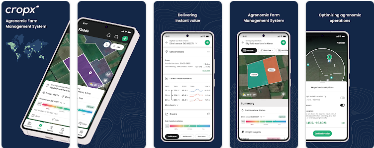
We listened to what customers loved, liked, and wanted to change in the old app, then made modifications to better suit their needs and supply a more enjoyable experience. The new app is faster, more reliable, and even easier to use.

After 6 years of building features on the original app architecture, we knew we had to start over to create an app that had the ease of use and functionality that could grow with us as CropX expands its capabilities. While we focused on a user experience that feels like it’s just an intuitive update, it’s actually a completely new app built from the ground up.
The result is a mobile app that lets users access and organize the information they want more quickly and easily, while also improving the internal processes so that the app is faster and more reliable. The new app is also more scalable and allows us to quickly add new features.
Main improvements include:
Navigation
- New app navigation for easier data browsing and discovery
- Improved quick links for common actions like adding new data, connecting with sensors via Bluetooth, and more
- New left/right swipe action to scroll field data
- Easier navigation between fields and sensors, different graph types, and more
- Powerful new search and filter functionality
- New display mode options
- Toggle between list mode and map mode to browse multiple fields
Usability
- Larger buttons and fonts for easier outdoor usage.
- Improved response time performance for faster use
New functions
- “Missing Sensor readings” message
- Easier location confirmation screen
- “Last measurements” reading
Communication processes
- Better communication with the sensor (BLE) and streamlined work processes with the hardware
This update does all this while keeping the functionality of the previous app version and setting the stage for future improvements. In the coming months, we will be updating the app with even more functionality. Exciting times!


